Creating this Blog
23 March 2013
Every once in a while I want to have my own little place on the Web where I could write about stuff I do.
After reading about Hugos move to Jekyll I knew that this is exactly what I want. I love exploring new things and Jekyll seems to fit my needs exactly.
I knew, I could have used tumblr or any of these services to get started in under a minute, but thats not what all this is about.
I just want to try something new.
Starting the Journey

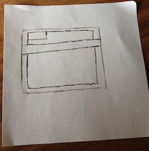
Everything has to begin somewhere. For me all my things start on those tiny little snippets of paper you see in the image. The idea was that I want to use only two colors for the main part of the design. I decided to start with the “Desktop First” approach as I know that the design should be as simple as possible and therefor adapt quite nicely on mobile. In retrospect I think that this was the right thing to do for this project.
After the first sketch I tried to build it on CodePen the perfect place for trying new stuff. All the things I need to build something quick are there. The best part is that I can write SCSS (including Compass) without any setup needed.
More sketches
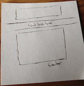
Finished building my first sketch I wasn’t satisfy at all. It looked just boring. I had to change something to make it more interesting. I tried to come up with something simple but slightly more interesting to look at.

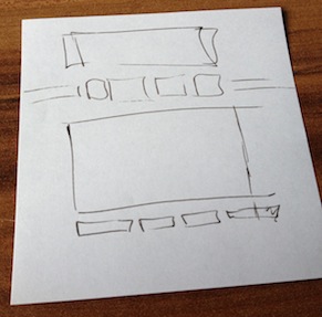
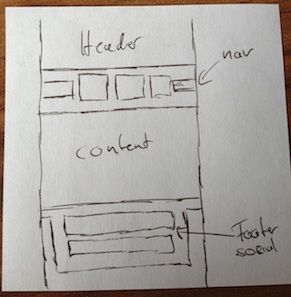
I kept the idea of using only two colors but separated the header, navigation and content from each other. After repeating these two steps a few times I finally came up with the final sketch.

I came up with the basic layout for this site. Separating the link in the navigation from each other and make all of them slightly bigger than the vertical bar surrounding them really helped making it look great. Adding a footer in quite the same style to the bottom of the page made it awesome. I am very pleased with how it looks now.
Adding Color
The goal was to create a design that would only relay on two main colors. Finding the foreground color was quite easy, I chose white. The tough part was to find a good looking background color. I tried to find a good color using kulor (Beware it’s written in Flash!) It should be some light blue color not to bright and pleasant on the eye.
Colors are such a subjective topic so I thought that it’s the best to ask what other people think. So I chose a color I liked and asked some people I know from CodePen Hugo, Tim, Sara, Josh, Mads and Ana (basically the whole 4ae9b8 Team) if they liked it.
They provided great feedback, and after some little changes, to the color and some minor design changes I was ready to build the real thing!
Setting up Jekyll + Compass
Installing Jekyll was straightforward on OS X 10.8.3 - I just typed gem install jekyll for jekyll, sudo gem install rdiscount for RDiscount and sudo easy_install Pygments for the syntax highlighting. For a more in depth explanation, you can read this tutorial recommend by Hugo in his post on moving to jekyll which inspired me to start this blog.
Compass was already installed on my machine, so I just started an empty project and configured the config.rb and was good to go.
Make it mobile friendly

After adding some structure to my SCSS which was written on CodePen, I started with making it responsive. As I mentioned before this design is quite simple so I don’t have to go all that fancy with my media queries, the only thing I had to really care about is the Navigation, the links in the footer and removing some margin to use the limited space a little better.
Wrapping it up
After these years, I now have my own little blog, built from ground up by myself (at least for the front-end). Learned quite a lot during the whole process and I hope that I will learn a lot more while writing here about what I do.
If you find a bug or just think that you can improve something, please open an issue on GitHub. Or just let me know about it on twitter.